
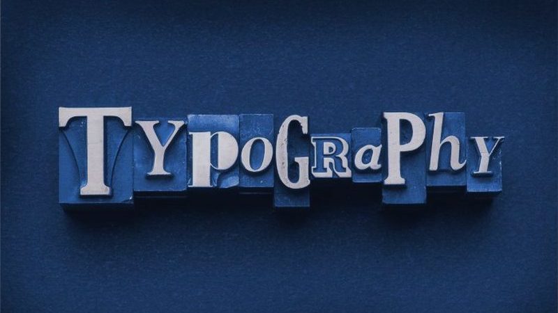
Today, typography is a grey eminence in every design. It’s not that obvious as sprites, color scheme or block location. In a high-quality theme or design, it may be barely noticeable, but a poor illegible font will immediately draw your attention. A color scheme that doesn’t fit the subject, misalignment or spacing – you’ll see when something isn’t right with the typography of your design. Surprisingly, but this hardly noticeable part can easily spoil the entire impression of your design and the product.
So, typography is the part of your design you can’t ignore. Sometimes you want to create your own font for specific products. Sometimes you buy or download an existing font and use it. In the second case, you can just play around with a couple of fonts and choose the one that meets all the requirements. But what about original fonts? Sometimes you don’t have any other option except for using your custom typography. Don’t worry if it doesn’t feel appropriate for your current product. We want to share with you 5 simple but efficient ways to bring your font to a higher level.
Provide high readability
It’s one of the most important points to create great typography for your designs. No one will like your font if the message is unreadable, right? Don’t create too cutesy letters – there is a high chance that it’ll be hard for users to read the content, especially with low point size. Always compare the background and font colors. Some font colors can blend into the background so it’ll be almost impossible to read anything. Some color combinations may look too toxic so it’ll be hard to read the text without a migraine. Consider using the plain white font with black border. It’s classy and has the best readability on basically every background color.
Fit the mood of your product and audience
Your typography needs to correspond to the general product purpose and be comfortable for the audience. It’s understandable – grim gothic font most likely won’t fit the blog about planning the birthday party and vice versa. The other point is your audience. Make sure that your clients or readers are comfortable with this typography. It depends on various factors: readers’ age, gender, country, profession, etc. Consider this fact if you want to create some stylish specific font for a particular social group. On the other hand, you may want to develop some kind of universal solution that will be perfect for a wider audience.
Never forget about alignment, spacing, leading, and kern
Basically, alignment describes the position of typography and three others describe the distance within the text. Spacing is the distance between words, leading describes the space between lines and the kern is all about the distance between characters. This characteristic is not that obvious but still influences the effect of the whole design. All four of them may visually improve the typography or worsen it. Try to find perfect values for spacing, leading and kern and align the text in the best possible way and you’ll make your font better.
Use the hierarchy of design
Every high-quality design and typography follow the hierarchy of needs. Create a strict structure of your content. Group the information by importance and use different text size to separate those parts. Use headings and subheadings to provide a clear text structure. The other great idea is to combine all related items together. After all, it’ll be much easier for users to read and understand, improve the overall readability and boost UX (User Experience).
Maintain the high resolution of your fonts
High resolutions is a must for every great typography. You may never know what font size you’ll need in your project so you must ensure that you typography will look perfect in any case. The problem is that low-resolution fonts stretch on high point size. Distorted fonts always look awful so try to avoid those situations. Of course, you may just don’t use high font size in your projects or use external high-resolution fonts for this purpose. It’s always better to keep the typography resolution as high as possible – that will help to avoid possible problems in the future.
Final thoughts
Typography plays a special role in every design. It may be inconspicuous to the majority of users, but everyone will notice low-quality, unreadable font. Nowadays you are able to choose from thousands of different fonts that may fit various subjects and products. However, sometimes you need to develop your own custom font or change the existing one. Every inappropriate font can be improved so you can always make outstanding typography for your product, but it may require some intense hours of work. Always ensure that the font is readable and fits the context and the topic of discussion. Find out optimal values for alignment, spacing, leading, and kern. Think about the resolution of your font so that the high point size doesn’t worsen its quality. These steps are quite simple but still remain efficient ways to make your font better.