We had to analyze the current user experience of a music studio web app. The app designed for non-professional music-lovers who can’t imagine life without music and like creating new sounds. The client provided the design style for the main elements and the color scheme. We had to analyze the current page and make it more convenient and simple for users. Also, we needed to add the records library to let users easily find sounds and instruments.

We analyzed the app and asked the client how does he see the new interface. Based on the listed requirements and our conclusions we created a wireframe via InVision to describe the way we want to locate the elements on the page.
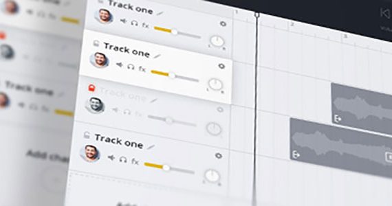
Considering that App targeted on amateurs, not on professionals, we decided not to crowd the interface with numerous instruments and icons. To keep it simple and obvious for non-professionals we hid secondary instruments and kept only the main ones.

All the instruments were moved to the top from the bottom, since we wanted to have the panel at eye level which is much closer to the main board and much more easy to access. The chat with active and inactive friends was moved to the right edge and modified according to modern trends.
The new color palette fits the general style of the website so it looks pretty cool and professional.